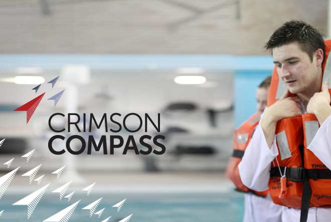
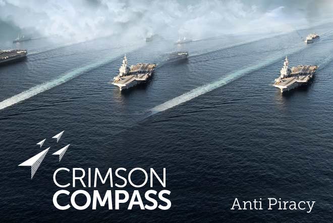
Crimson Compass is a new business offering nautical training courses on a variety of subjects ranging from Anti Piracy Security, PTSD Counselling and Risk Management.
Crimson Compass was looking for a brand identity which would speak about their positive approach to guiding and teaching students about a variety of nautical and terrestrial related courses. It had to be simple, attractive and upbeat.
Crimson Compass
Port Glasgow, Inverclyde
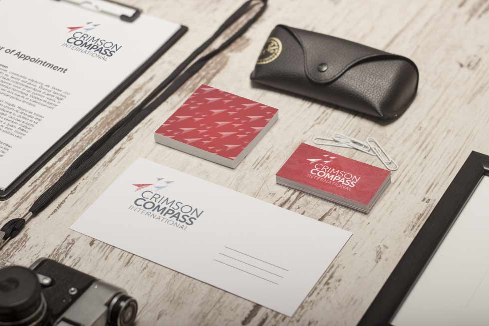
The logo is influenced by compass points, which are all arranged to point in a singular direction northwards, suggesting a common direction & hinting at the educational nature of the business. Each compass point: North, East, South and West is assigned a colour, making up the colour scheme of the brand. This compass influence extends to photography and graphics, with elements such as hatching, latitude lines, radii etc. being used to make up geometry and compositonal elements.


Amazing work from Design Hero, the new website brought my business into the 21st century and the Crimson Compass brand helps me stand out from the crowd in a highly competitive marketplace.